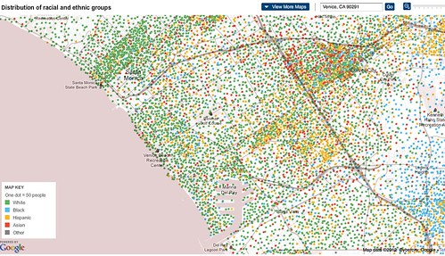
The New York Times has featured an awesome Social Explorer map that uses Google Maps to graphically display the Census Bureau’s American Community Survey, based on samples from 2005-2009.
Click on the map, enter 90291 and check out the neighborhood!
Maps include distribution of racial and ethnic groups, income, housing and families and education. The data is best regarded as an estimate, but interesting nonetheless.


